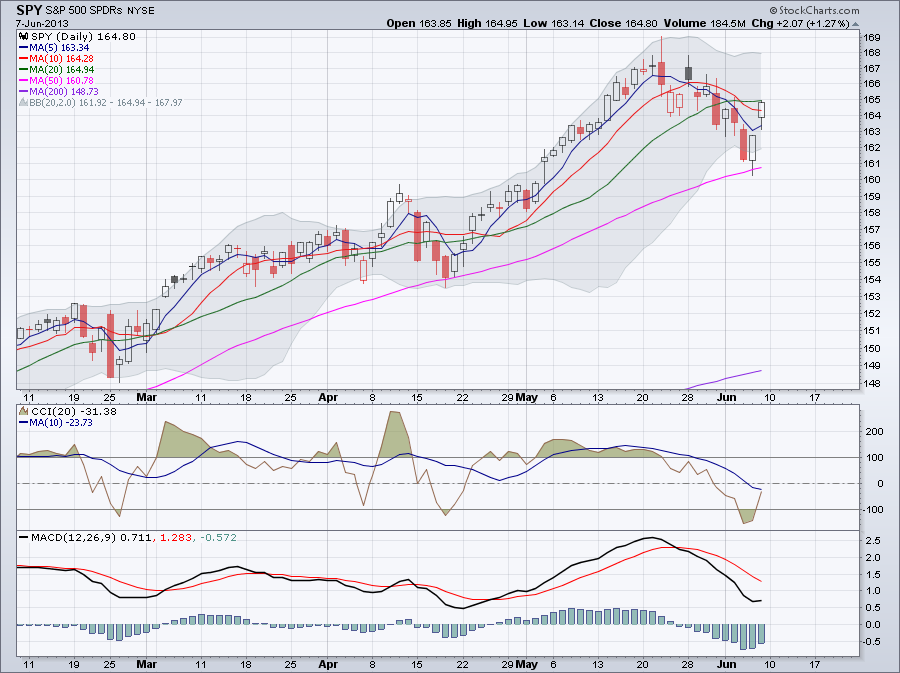
The daily chart below shows SPY, the S&P 500 ETF for the past 12 years with the 50-day, 200-day, 400-day and 600-day moving averages and the 600-day Bollinger Band. Below the chart there is the PPO(50,600) (green) and PPO(200,600) (red). PPO is the Percentage Price Osciilator which is a momentum oscillator similar to MACD. It measures the difference between moving averages as a percentage of the larger moving average. For example PPO(50,600) measures the percentage difference between the 50-day and 600-day moving averages. Notice that both the red and green lines are reaching unusual high levels. Also on the chart notice how the moving averages are fanning out and the lower 600-day Bollinger Band is curving down. Also the price is above the upper Bollinger Band.
0 Comments
MFI the Money Flow Index is a momentum oscillator calculated from both volume and price. The calculation is similar to the calculation of RSI the Relative Strength Index. For this reason it is also called the volume-weighted version of RSI. Theories suggest that volume leads price and also RSI momentum oscillator leads price. Including volume in the calculation can increase this lead time.
The weekly charf below shows DIA the SPDR DJ Industrial Average ETF with MFI below the chart. Notice that DIA recently slightly moved lower but MFI failed to reach new lows. I consider this a bullish divergence. We will see the development of this divergence in the next couple of weeks. The weekly chart below shows SPY with the 2 period RSI and MACD. Notice that this is the second time this year when RSI(2) is below 30. MACD is below its signal line which is also sign of weakness.
Below you can see the weekly chart for SPY with the 14 period StochRSI below that. StochRSI failed to reach new highs and is turning lower.
The Accumulation Distribution Line is calculated from the current price and volume. It measures the cumulative flow of money into and out of the security, in this case the S&P 500 (SPY).
There are three steps to calculate ADL. First, calculate the Money Flow Multiplier which tells us the relationship of the current close to the high-low range. The Money Flow Multiplier fluctuates between +1 and -1. It’s positive when the close is in the upper half of the high-low range and negative when in the lower half. Second, multiply this by the volume which gives us the Money Flow Volume. Third, calculate a running total for the Money Flow Volume. Here are the 3 steps of the calculation: 1. Money Flow Multiplier = [(Close - Low) - (High - Close)] /(High - Low) 2. Money Flow Volume = Money Flow Multiplier x Volume for the Period 3. ADL = Previous ADL + Current Period's Money Flow Volume We can use ADL to confirm the price trend or look for bullish or bearish divergences. The chart below shows that both the price chart and ADL is moving down. This reinforces the current selling pressure. The indicator window also shows the 20-day SMA for ADL. ADL is currently below its 20-day SMA which is also bearish. It’s nice to ride a trend for as long as you can without getting stopped out too often. Let’s look at the uptrend the US markets had which started last year in Mid-November. Were you able to stay in this uptrend from the beginning to the end?
When you trade you always want to set your stop-loss to limit your losses. Never trade without setting stop-losses. As the market moves up in an uptrend you want to adjust your stop-loss to increase your profit, this is also called trailing stop-loss. The trailing stop-loss stays below the price in an uptrend and above the price in a downtrend. Setting the stop-loss too close to the price, results in being stopped out too early and too frequently. Volatility changes during an uptrend (or a downtrend) and from time to time prices can be quite volatile. Usually that’s when you get stopped out. So it makes sense to use a trailing stop-loss which gives a volatility-based buffer. This means that when volatility increases the distance between the price and the stop-loss increases. That’s exactly what the Chandelier Exit does. The Chandelier Exit is usually calculated for 22 trading days which is a month. The calculation is as follows for an uptrend: Chandelier Exit (long) = 22-day High - ATR(22) x 3 and Chandelier Exit (short) = 22-day Low + ATR(22) x 3 for a downtrend. ATR the Average True Range is used to calculate volatility. In the expressions above 3 is used as a multiplier but it can be changed. For more volatile securities you want to increase it and since downtrends are more volatiles you want to increase there too. The chart below shows SPY with too Chandelier lines, the blue is calculated with 3 and the red with 4 as a multiplier. As you can see 4 as a multiplier would have kept you in the trade longer since there were times when SPY was quite volatile. As I noted yersterday SPY found short-term support and nicely advenced today. The chart below shows the daily chart for SPY today. There is certain weakness on the chart. One of them is that MACD is still below the signal line and the other one is that CCI and its 10 period MA are both below 0. If SPY continues to move up next week my upside target would be close to the upper Bollinger Band.
The chart below shows SPYwith the 64 period (which is about 3 months in trading days) Williams %R oscillator below the chart. When Williams %R is greater than -50, it's bullish. Currently the 64 period Williams %R is -29.11.
The 14 period RSI on the monthly chart is above 70 in overbought territory. Last time this happened in 2006.
|
Loading
Search Site
Links
Archives
September 2014
Categories
All
|